What Makes a Professional Book Cover Design Stand Out?
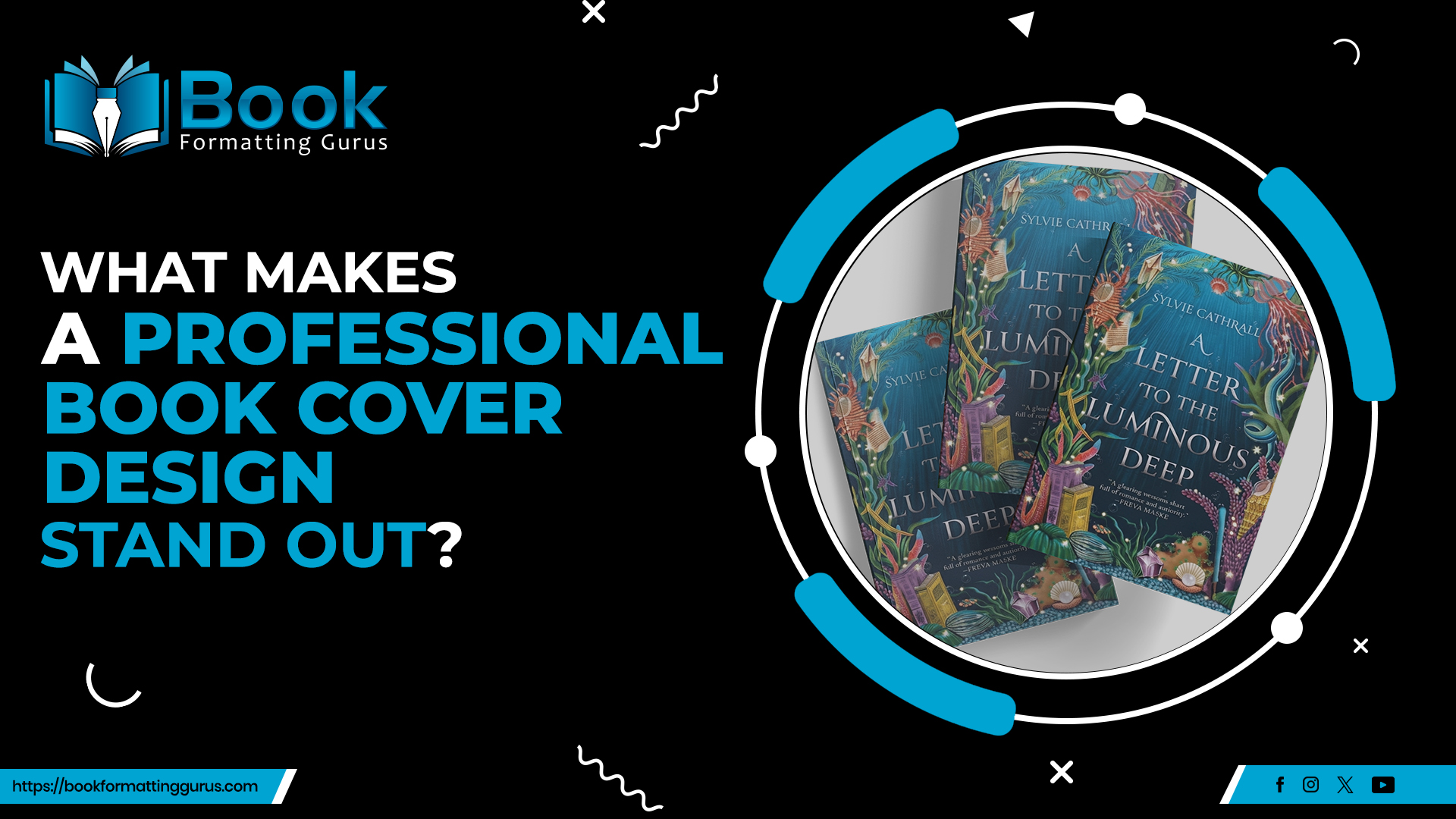
A cover is often the first thing a potential reader notices, long before they read the description or sample the opening pages. In a matter of seconds, it needs to communicate genre, tone, mood, and subject matter clearly enough to earn a second look. In a crowded market where thousands of titles compete for attention every day, a professional book cover design is not a luxury; it is a practical necessity. The visual choices made on that single image, from color palette to typography, shape a reader's first impression before a single word of the story is read. This is why many authors turn to a book cover illustration service rather than attempting to design a cover alone, since bringing a story's central idea to life visually often requires more than personal taste. Authors who understand what separates an ordinary cover from a professional one are better equipped to make informed decisions, whether they hire a designer or evaluate one they already have.
Strong Concept and Visual Direction
Every effective cover begins with a clear creative concept rather than a collection of appealing images. Before any artwork is created, a designer needs to understand what the book is actually about: its central conflict, its tone, and the feeling it should leave with a reader. A cover that reflects the true nature of the story tends to resonate far more than one built around generic or unrelated imagery.
Genre identification plays a major role here. A thriller and a cozy mystery might share surface similarities, but the visual direction for each should feel distinct enough that a browsing reader immediately senses which one they are looking at. Matching that direction to the intended audience, rather than to the author's personal preference, is one of the clearest signs of professional book cover design. Many authors work with a book cover illustration service at this stage to help define that concept, since an outside creative perspective can spot possibilities the author might overlook.
Turning a Story Into a Professional Book Cover Design Concept
Once the concept is defined, it needs to be translated into something visual and recognizable. This is where that creative translation happens, turning an abstract idea, such as a theme of isolation or a setting steeped in history, into a specific image, color scheme, or symbol that a reader can immediately connect with the story.
Typography That Supports the Story
Typography carries as much responsibility as artwork, yet it is often overlooked. Font selection affects readability, and readability matters more than decoration. A title set in an elaborate script might look striking as a small image, but if it cannot be read quickly at thumbnail size, it fails at its most basic job.
Effective typography establishes a clear hierarchy: the title generally dominates, followed by the author's name, with any supporting text placed with intention rather than as an afterthought. Font pairing matters too. Combining two typefaces with enough contrast to feel intentional, but not so much that they clash, gives a cover a more polished look, and this attention to font selection and hierarchy is a hallmark of professional book cover design. Typography should always work alongside the artwork rather than compete with it. A cover with striking illustration undermined by cluttered or mismatched lettering rarely feels complete.
Strong Composition and Visual Hierarchy
Where elements are placed on a cover directly affects what a viewer notice first. A strong composition guides the eye toward a clear focal point, whether that is a character, an object, or a striking use of color, before moving naturally toward the title and then the author's name.
Balance and negative space matter as much as the imagery itself. A cover crowded with too many competing elements often confuses rather than intrigues. A book cover illustration service typically handles this compositional work as part of the design process, arranging title, imagery, and author name so nothing fights for attention at the same time.
Color Choices That Communicate Mood
Color is one of the fastest ways a cover communicates genre and emotional tone, often before a reader consciously registers why. Deep reds and blacks suggest mystery or suspense. Soft pastels and warm tones often signal romance or children's literature. Cool, desaturated palettes can suggest literary fiction or introspective nonfiction, while saturated, high-contrast colors tend to signal fantasy or fast-paced adventure.
Color choices should be guided by genre and emotional tone rather than personal preference alone. This is a subtle but important element of professional book cover design, since a shade the author loves can still send the wrong signal to readers browsing a genre they know well.
Original and Relevant Imagery
Imagery should have a clear, meaningful relationship to the story it represents. Whether a designer uses original illustration, carefully selected photography, or custom artwork built specifically for the book, the goal is the same: the image should feel connected to the characters, setting, or central conflict rather than chosen because it looked appealing in isolation.
Symbolic imagery can be particularly effective, using an object or visual metaphor rather than a literal scene from the book. This is where a book cover illustration service becomes genuinely useful, since transforming an abstract story concept into a recognizable visual identity often requires artistic skill that goes beyond selecting a stock photo.
Genre Expectations and Reader Recognition
Readers develop visual expectations for genres over time, often without realizing it. A cover needs to communicate its genre quickly, ideally within a glance, while still meeting those reasonable expectations. This does not mean every fantasy cover needs a sword, but the overall tone and imagery should not mislead a reader about what they are about to read.
Originality still matters within these boundaries, and meeting genre expectations while still feeling distinctive is a hallmark of professional book cover design. A good book cover illustration service understands these genre nuances well, which helps a cover stand out without sending the wrong signal to the readers it is meant to attract.
Designing for Multiple Formats
A modern cover rarely exists in only one size or format. It needs to work as a full-size paperback or hardcover, as a small ebook thumbnail on an online store, and as a cropped image on social media or promotional graphics. Details that look impressive in a large print version can disappear entirely when reduced to the size of a postage stamp on a phone screen.
This is one of the more practical, and often overlooked, aspects of professional book cover design. A reliable book cover illustration service tests designs across formats before finalizing artwork, since fine detail and small text tend to be the first casualties when a cover is shrunk down.
Print Quality and Technical Preparation
Creative concept aside, a cover also needs to be technically prepared for publication. This includes working at a high enough resolution that the image does not appear blurry, understanding color considerations for print versus screen, and accounting for bleed and trim requirements so nothing important is cut off during printing.
For print editions, spine placement needs to account for page count, and safe areas need to be respected so that text is not too close to the edges. Working with a book cover illustration service familiar with print specifications can prevent many of these technical issues, and this kind of preparation is a hallmark of professional book cover design, even though it rarely gets discussed.
How a Book Cover Illustration Service Adds Value
Working with a book cover illustration service typically follows a defined process, even when the specific steps vary from one provider to another. It usually begins with understanding the manuscript itself, not just a brief summary, so the resulting concept genuinely reflects the story rather than a generic interpretation of its genre.
From there, a visual concept is developed, often through sketches or mood boards, before any final artwork begins. Composition is refined so the most important elements draw the eye first, typography is selected to match the genre and mood, and everything is prepared for the technical requirements of the intended publication format. A thoughtful provider can also help authors build a cohesive visual identity across a series, which helps readers recognize an author's books at a glance.
Common Book Cover Design Mistakes
Trying to communicate an entire plot on a single image is another common pitfall, and so is designing purely around personal preference rather than the intended reader. Avoiding these pitfalls is central to achieving genuine professional book cover design, and each one is avoidable with a bit of planning and an outside perspective.
What Makes a Cover Memorable?
Memorable covers tend to share a handful of qualities: immediate visual clarity, a strong underlying concept, typography that supports rather than competes with the artwork, and a clear emotional connection to the story. Genre recognition and originality also play a role, along with a level of execution that feels intentional rather than accidental.
Memorable does not have to mean complicated. Some of the most striking covers use a single, simple concept executed with precision and purpose, rather than an image packed with detail. What ties these qualities together is consistency: a cover that feels like a deliberate, unified visual statement rather than a collection of separate design choices.
Practical Checklist for Authors
Before finalizing a cover, it helps to step back and evaluate it against a short checklist:
Does the cover communicate the genre clearly at a glance?
Is the title easy to read at both full size and thumbnail size?
Does the imagery have a genuine connection to the story?
Is there a clear focal point guiding the eye?
Does the design still work when reduced to a small thumbnail?
Is the color palette appropriate for the genre and tone?
Does the typography support the mood rather than distract from it?
Does the cover look professional in both print and digital formats?
Does the design appeal to the intended reader rather than the author alone?
Does the finished result feel distinctive rather than generic?
Running through these questions is a practical way to evaluate whether a cover reflects the standards of professional book cover design, rather than relying on a single subjective impression.
Conclusion
A cover's job goes far beyond making a book look attractive. It serves as a visual introduction to the story, communicating genre, mood, quality, and identity before a reader reads a single word. Understanding what makes professional book cover design effective, from concept and typography to composition, color, and technical preparation, gives authors a clearer sense of what to look for and what to ask for.
Working with a book cover illustration service can help translate a story's central idea into a visual identity that a reader connects with immediately, particularly when original artwork or illustration is involved. Ultimately, the most useful way to evaluate any cover is from the perspective of the reader encountering it for the first time, rather than from the perspective of the author who already knows the story inside and out. A cover built with that reader in mind, supported by sound design principles and careful preparation, is far more likely to earn a second look and, eventually, a reader.


